I was driving into town this morning when I missed a turn and had to make a U into Karamunsing Complex. Has anyone been there recently?
Work is halfway done to add more space to the building and some of the columns are right on the side of the road. I see this happen again and again in this town: Lintas, with the new multi-storey carpark on the fringe of the road, the on-going construction of Harbor City opposite Sutera Magellan, which juts into the only boulevard in KK, a new building in Asia City which also suddenly juts into the road, next to Chung Hwa School and perhaps many more that I'm not aware of. If these buildings were built a long time ago, it is understandable. All these buildings with shallow setbacks have been built the last few years and continue to be built without regard to setbacks bylaws, provision for road extensions or future expansion.
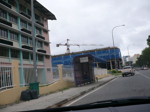
Part of Asia City. Asia City blatantly creeps onto the roads, here facing the road leading to KK, and the back too, facing Centrepoint. There are only two roads parallel to the coast, this one and the coastal road. If road reserves are taken up by (new) buildings, where's the room for future expansion??
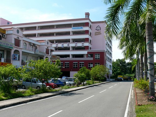
Another outrageous building that seeps onto the road is the new multi-storey carpark at Lintas. It's so near the road that there's no path at the side of the building because it is right on the road. What the??
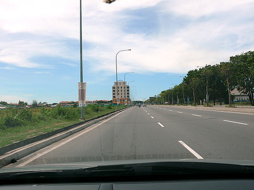
So you are driving along my favorite road, one I call The Boulevard. You come down the new flyover and suddenly the road narrows; it merges into the right lane. Why? Because further up, a new mass of shoplots is being built, on the zig of the road, making it a bottle neck.
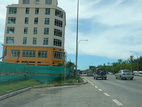
You drive past this awful building ("With a giant colander on top" said my daughter) and the road zags in. Which means the road can't be expanded because the building is in the way. A building that wasn't built 10 or 5 years ago when planners didn't know better.
Work is halfway done to add more space to the building and some of the columns are right on the side of the road. I see this happen again and again in this town: Lintas, with the new multi-storey carpark on the fringe of the road, the on-going construction of Harbor City opposite Sutera Magellan, which juts into the only boulevard in KK, a new building in Asia City which also suddenly juts into the road, next to Chung Hwa School and perhaps many more that I'm not aware of. If these buildings were built a long time ago, it is understandable. All these buildings with shallow setbacks have been built the last few years and continue to be built without regard to setbacks bylaws, provision for road extensions or future expansion.

Part of Asia City. Asia City blatantly creeps onto the roads, here facing the road leading to KK, and the back too, facing Centrepoint. There are only two roads parallel to the coast, this one and the coastal road. If road reserves are taken up by (new) buildings, where's the room for future expansion??

Another outrageous building that seeps onto the road is the new multi-storey carpark at Lintas. It's so near the road that there's no path at the side of the building because it is right on the road. What the??

So you are driving along my favorite road, one I call The Boulevard. You come down the new flyover and suddenly the road narrows; it merges into the right lane. Why? Because further up, a new mass of shoplots is being built, on the zig of the road, making it a bottle neck.

You drive past this awful building ("With a giant colander on top" said my daughter) and the road zags in. Which means the road can't be expanded because the building is in the way. A building that wasn't built 10 or 5 years ago when planners didn't know better.
This Harbor City project is an extension of the ugliness of Asia City. Right across is the famed Sutera Magellan Resort, one of the top 2 most well-designed and maintained hotels in KK. It's like black vs white, good vs evil, ugly vs beautiful, a contradiction of tastes and vision.
Karamunsing Complex is the best example of the reasons why this city is called 'cowboy town'. Anything goes. Rules can be broken as long as you have the might and power. Prominent politicians have been known to pull an OJ Simpson. I remember more than 10 years ago when I was working in Tun Fuad Building, just opposite from Karamunsing Complex, people in K Complex suddenly rushed out onto the roads. They had heard a loud crack and parts of the building were indeed to have been found with new cracks and barriers were set up to cordon off certain areas. Within a few weeks, people slowly went back and the whole thing is forgotten. Since then, the building has been renovated and revamped by its new owners with such blatantness it makes me wonder if they are free from the city's building codes and regulations. Inside the podium, new space was added by cantilevering into the sides of the wall next to the elevators on each floor. How did the authorities find this acceptable? Is is really safe, have they considered the loading? This is the reason I just don't go to Karamunsing Complex, period.
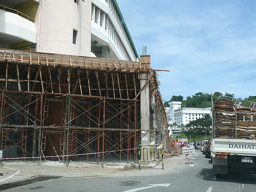
This one takes the prize. The columns of the new addition are FRIGGING right ON THE ROAD.
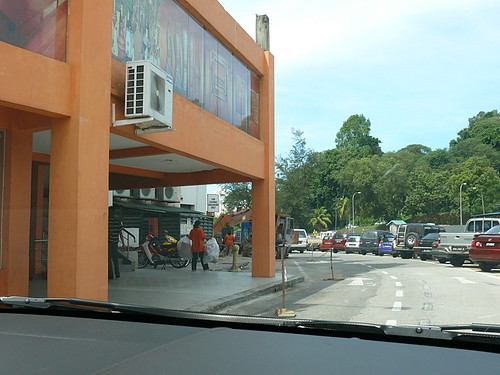
Drive further up and this is a completed part of the expanded building. Was any piling done? Don't we need a safe distance from the walls of any building to the road?? So okay those are just columns, not walls. You have a driver ram into this column and see what happens to the building. Besides, the way it goes, very soon there'll be walls. Right after they get the O.C. Look what happened to Warisan Sq.
And now, they are adding more space and spilling onto the road. On top of the safety factor, these new additions are pure eyesore. This city has turned from a nice, pretty town into a hotch potch haphazard ugly maze, both macro as in overall orientation of the buildings and micro as in the individual ugliestness of each building. And it will get worse as more buildings are added with no proper planning, vision and aesthetics. We will get as ugly as Bangkok. Politicians willing, we'll get uglier than Bangkok.
Which is truly a shame, because KK hugs a long shore & coast line so that if you drive on the coastal road, you have a breathtaking blue sea on the left. And you have the ugly city on the right. I've always imagined how the city will look if we had good architects and planners. But the truth is, we just don't have the right authorities or even attitude to build this city. Politics and other factors rule the shaping of our skyline.
One of our most beautiful area is the Likas Bay coastline. Truly magnificent, on a sunny day when the sea is blue and the coconut and casuarina trees are swaying in the breeze. Even on stormy days, the long lines of swaying trees and the waves on the grey sea makes a gorgeous scene. When they started work on the esplanade (the plan apparently is to make the whole of the coastline from Tanjung Aru to Yayasan Sabah Building a long esplanade), I was happy. I imagined a simple, natural walkway where families can walk, looking out at the sun setting over the sea (yes, we are so lucky the sun sets over the sea and not the mountain as in the case of the other towns like Tawau and Sandakan). The coastline is so beautiful you just cannot build anything to distract the beauty of the area.
My heart sank when I drove to 1 Borneo last weekend. Midway along the Likas Bay road, the new esplanade stood out obtrusively. Instead of the beauty of the sea, the casuarina trees and the shore, you now see the man-made concrete walls, and strange enough, some totem pole-like lights, and worst of all, a 2-storey intrusive bright orange building that looks like a public toilet right in the middle of it all. I truly want to cry. I beg the authorities to please stop the further building of the esplanade. I can imagine the whole coastline marred by these concrete walls and dotted with orange buildings. That would really be a tragedy for KK, like plastic surgery gone wrong on a natural beauty. The worst thing would be if different sections of the esplanade are designed by different people, as I heard they are, because the section in front of the Promenade apartments is reportedly assigned to a middle east group. Imagine a different design and concept every few kilometres. Have we not learnt from Kuala Lumpur's LRT?
I will be taking some pictures of these absurd construction in the city. I am also going to make a list of the top 10 ugliest buildings in town. Please tell me what your choices are, and after compilation, I will post The Top 10 Ugliest Buidlings In KK. I need your input.

23 comments:
Hi Terri,speaking of the landscape planning by Malaysian Gahmen, it is truly embarassing. I believe you have travelled to European countries or at least Singapore and Japan. Try google earth them. The planning is truly breathtaking even from the satelite viewpoint. Try zooming it to Kuala Lumpur... it brings you to tears.
Perhaps Terri, you could convince your daughter to contribute to KK by setting up her own company there with a vision to make KK a better place through her architecture.
PLEASE have this printed in the papers. I do not think the politician read this. Or even if they do, will they care? I totally agree with you about the new esplanade - the orange building is such any eyesore, even if it was a toilet, why can't they give it a native look (you know what I mean.) and the totem poles - what the logic behind that? Like you, I had thought the the esplanade would just be one long simple boardwalk, perhaps with some nice native carvings on the floor. We don't even have to touch on the one behind the Promenade Apts. That is AN EYESORE! AN EYESORE! The people who approved that plan should be taken to task! What in the world are the city planners and politicians turning KK into? All those overseas trips never paid off? I feel like speaking French here but kids are reading this.
Here are a few more ugly buildings:
1. The triangular building at the Australia Place in town.
2. The new Wisma Wanita at Jalan Tuaran.
3. One Borneo.
4. The Federal Archive along Jalan Penampang.
5. Bandaran Berjaya as a whole.
6. The Berjaya Palace Hotel.
7. Api-Api Centre.
8. Segama Complex.
9. Sinsura Complex.
Actually, the whole town is ugly. It will be easier to name nice looking buildings.
One Borneo DEFINITELY
Sabahan
KK is so small once you name 10 buildings you have named them all.Lol.
Even the museum is now on my list of 10 ugliest buildings. Anyone been there lately? It has turned ugly! Its an embarassment to show visitors our so called museum. Why do other places look so pretty and well planned, simple and clean? Do you think the authorities and powers really care what our city turns into? And 1Borneo! Oh so ugly! Api2 Centre too, what an eyesore in the middle of town. I wonder, how do these architects pass their exams?
Ugly
1 Borneo. The outside still looks like a warzone.
Palace Hotel
Central Plaza
Kompleks Karamunsing
Api-Api. Whats with the green paint?
Wisma Dang Bandang
The new Federal Govt complex next to UMS.
Harbour City. Yes I know its not done, but its looking pretty ugly.
Yes, the triangular/wedge shaped building in Australia place.
Income Tax Dept. Money doesn't buy taste apparently.
KK Plaza
Main Post Office
Bad
Bandaran Berjaya
Segama/Sinsuran/Kampung Air
Wisma Dang Bandang
Main Market in Town
Good
KK Times Square doesn't look too bad.
Gaya Street is actually quite pleasant with the trees in the middle of the road.
Magellan Sutera
UMS
a. 1 borneo
b. Sabah Trade centre! If u can, take the pic of their roof! then U get what I mean. Badly design.
c. Api-api apartments (the green paint, as per Fooman).. and if you can detour to Colonnades apt (opposite St.Fancis Convent)... their colouring are bad! (same maanagement with Api2apt)... tt's why u see their colours R the same! THey dont have enuff paint, so tat's why u see the lower area, half green. half dark green for the same unit! uglie enuff!!!
me, the Dutchbaby pancake.
In bolehland, nobody gives a damn about functionality and beauty. They are only interested in building and building to line their own pockets.
Its all about money. Think they care about the state of the city or the colour of the buildings.Build a building n they park cars all over. just look at income tax building. nicebuildings maybe like kuwasa - not bad hor - aiii cannot think of any more. that bad ah. dont talk about buildings...that supposed to be central park in the city or is it city park - what a joke. do we actually have a city council?
About Karamunsing. In Sabah, semua boleh! Ain't that great?
Then (touch wood) a tragedy happens and we get the usual knee jerk reaction from the politicians.
john: ok, will google earth soon. singapore's landscape is the best in SEA, every tree is well trimmed n fed. msia gahmen is very 'want face'. they'd rather bear with depletion of ozone layer than ask singpore for gardening tips.
ha, even if she's tt good, do u think tt when it comes to jobs, ppl here get it on merit?
Me Sincerely: i am so glad tt i'm not the only one who finds the new esplanade ugly. i hope tt bldg isn't a toilet. why a toilet there?? do u think if we take to the streets they'll do smthing about it:DD? it's so sad.
anon: :)) u r right. i am taking note.u have mentioned almost all my list.
sabahan: me too, what's tt yellow roller coaster-like structure??
anon: right :D
anon: right on, i agree about 1 borneo & apiapi. i hated 1 borneo at 1st sight.it's embarassing.
fooman: yi n i were talking about it in the car, n i come back n saw ur list which is very similar to ours, inclu the nicer bldgs. we passed by times sq, i said not too bad, then she said the likas mosque's not bad, then i said ums n she said yayasan maybe. interesting, let's get more feed back b4 i finalise the list.
btw, where's wisma dang bandang? what kind of name is tt??
dutchbaby: 1 borneo again! haha, so i'm not the only one with taste :D talking of paint, central plaza is another joke. who in the world would color a mall 10 different clashing colors?!
anon: spot on, tt's the reason for all the mess we have!
anon: yeah,since u r on tt, what's the point of having a mayor??
ruben: hi. sad isn't it, only a knee jerk. everything is so blatant here, it's like so what, no one can stop me.
you said: We will get as ugly as Bangkok. Politicians willing, we'll get uglier than Bangkok. ... I've always imagined how the city will look if we had good architects and planners. But the truth is, we just don't have the right authorities or even attitude to build this city. Politics and other factors rule the shaping of our skyline. ... truly want to cry. I beg the authorities to please stop the further building of the esplanade. I can imagine the whole coastline marred by these concrete walls and dotted with orange buildings. ...
the fact is that greed and avarice rule terri, everywhere. (most everywhere.)
the bottom line is very few folks are raised to appreciate the aesthetic value of anything, only the profit and gain for the individuals involved. especially the populace as a whole.
this manifestation in city planning (not)is a trend that has been in the making worldwide for decades.
most folks say that to do otherwise is an infringement on their freedom to do as they choose with their property. but freedom is not a luxury, it is responsibility. the responsibility to be free, but to also be considerate of others and their freedoms and well being as well. until this is the mantra of the masses, we are all lost.
zoning is a good thing, but most folks misconstrue it as unnecessary government interference and control. in the town where my folks live back in the states they have a meeting every fall to decide what color lights people will use for outside decorations for Christmas. that way the whole village is the same and looks nice, not garish and ostentatious. they also dictate the colors you can paint your home and so many other things. but the overall effect at the end of the day is a wonderful and harmonious atmosphere for all to enjoy. many opposed it at first, but now most embrace it as the truth that it is.
Wisma Dang Bandang is next to Cathay Cinema. The registration department is located in that building
oh I completely agree with you! Likas Bay coastal road has a nice coastal zone profile and a breathtaking sea view and the new esplanade totally disturb the natural-view of Likas Bay. Some more, its ugly (orange, wtf?). I was hoping at least, a trail of walkway (fine with concrete if the DBKK insist) for the joggers etc and a small hut-like (ok concrete is allowed for this type of building) for washroom.
I just want the Likas Bay to retain its simplicity and natural beauty and not letting development turning KK into concrete-jungle. Afterall, KK is 'Nature Resort City', so DBKK should stick to that theme.
Sorry, I'm a bit workout in commenting your post but it is indeed an 'eyesore' to me. I was born and grow up & still living here at Likas bay.
Talking about the top 10 ugliest buildings in KK, I can list down endless of ugly building in KK but there are truly a few well-developed and pleasant-looking building in KK, one of it is KK Times Sq. At least KK Times Square blend well with the neighboring Sutera and Wawasan-area. So 2-thumbs up to them. Though they should be greening their open-space more, that my opinion.
KK developers need to learn more on blending colors etc and not just painting the building to make it outstanding. I said, bluerk to the colors and building design. lol.
and, very nice reading your blog! keep on blogging.
To add on to the list by Fooman, Wisma Budaya next to GSC, KK.
R
lunch guy: hear hear. it's all about money, get rich quick before the next group takes over. not wanting to sound like a lovesick anglophile, it is an unspoken truth tt 'westerners' do the best job in terms of making the most of the natural landscape n preserving its beauty. i love the way some cities n towns like the one u mentioned tt have strict laws on colors n even planting or removal of trees. i hear sydney australia is very much like tt. however if tt is impleted here, we'd prolly get laws tt would ensure garish tacky buildings bc asian tastes generally run along those lines. of cos, there are some who have good taste but far n few.
it really is such a pity because here, like thailand, we have very beautiful beaches n year-round good weather. we just don't know how to put to good use what nature has given us.
have u been to a town called carmel-by-the-sea, up the pacific northwest, along the pebble beach drive?? in tt town, roads r built around trees because tree cutting is a criminal offence. yet they've made the town quaint (i know it's trite) n so pleasant. i love it, been there 2x.
fooman: it's so dang i've not even noticed it. will look out for it.
anggun3: i hear u i hear u! believe me, i'm furious about thse matters too! i've just gone to the teluk likas taman n it turned out tt tt IS A PUBLIC TOILET, facing the main road. if i can, i'd shoot the guy who planned it.
kk a nature resort city?? i'm laughing my head off.
hey, high 5! i was thinking the same about times sq too:)) am so glad there are so many ppl with good similar taste. too bad the guys to approve building plans aren't us.
r: u won't believe this, but i was just there in front of wisma budaya this morning (to take a pic of asia city), n took a picture of it!! i was thinking, this building needs to be c4ed!!
you wrote: have u been to a town called carmel-by-the-sea, up the pacific northwest
yes i have, i had a cousin who lived there for years. she was an artist. i have not been back there since around 1973. that was back when so much of the coast was still like that. another town that is not too bad in some spots is santa barbara. a great town for food too. there is a cal uni in town so being a collegiate area it is possible to find some reasonably priced ones too. lots of veg-head places and a real melange of cuisines and some good fusion that is not so elevated in style that it loses its sens of purpose, which is to be eaten and enjoyed with out too much thought to the complexity of it all. (does that make any sense? LMAO?)
I have to say that they expand Karamunsing too much!!! Every single space of it they never let go!!!
I don't like the car parking in Asia City, its very narrow =.="
Central Plaza worst. Too colourful...
lunch guy: oh i love santa barbara too. great town to stroll around in, nice mexican ambience n yes, lovely restaurants. i also rmber a place called san luis obispo, smthing like tt. all those missions..reminds me of the eagles' hotel california :D
agnes: sad kk. totally mismanaged & misdeveloped.
Why is it that city government and architecs think they know better? When will the madness of building what we don't need end and saving what is really beautiful - mountains, forests, vintage buildings - begin.
Post a Comment